I want to first preface this with stating that this topic is not intended to suggest a best practice for Discourse design, or even recommend any changes with the current design. This is simply for informational purposes on how I ended up incorporating some Material Design elements in to my site.
I am not a professional, merely a hobbyist, so the code may be messy and sometimes bloated. It is simply what I ended up with to get the results I wanted. I would be happy to receive any input on how it can be optimized or improved upon in any way.
NOTE: I am not promising this code will work for the version your are on. I am currently on v1.3.0.beta7, so I had to manually remove the zebra stripes. In doing so I had to modify some code that you may or may not need to modify depending on your version.
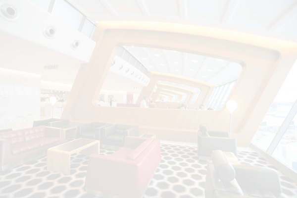
Categories View
![]()
My first order of business was to create more visual separation with my Categories. In order to do this, I entered the following CSS:
//add space between categories

.topic-list.categories{
      border-spacing: 0 1em;
      border-collapse: separate;
}

.topic-list.categories th, .topic-list.categories td {
    padding: 0 15px 0 15px;
}

//remove zebra stripes

.topic-list.categories>tbody>tr:nth-child(odd), .topic-list.categories>tbody>tr:nth-child(even) {
    background-color: white;
}
To add shadows to the Category boxes, I originally had this code:
.topic-list.categories>tbody>tr td.stats, td.category, td.latest{
  -webkit-box-shadow: 0 2px 5px 0 rgba(0, 0, 0, 0.16), 0 0 0 0 rgba(0, 0, 0, 0.12);
  -moz-box-shadow: 0 2px 5px 0 rgba(0, 0, 0, 0.16), 0 0 0 0 rgba(0, 0, 0, 0.12);
  box-shadow: 0 2px 5px 0 rgba(0, 0, 0, 0.16), 0 0 0 0 rgba(0, 0, 0, 0.12);
}
However, I found that added a shadow I didn't like to the Topic List as well, so I changed it to this, which is very specific to my site since only Categories have logos:
tr.has-logo td.stats,tr.has-logo td.category,tr.has-logo td.latest{
  -webkit-box-shadow: 0 2px 5px 0 rgba(0, 0, 0, 0.16), 0 0 0 0 rgba(0, 0, 0, 0.12);
  -moz-box-shadow: 0 2px 5px 0 rgba(0, 0, 0, 0.16), 0 0 0 0 rgba(0, 0, 0, 0.12);
  box-shadow: 0 2px 5px 0 rgba(0, 0, 0, 0.16), 0 0 0 0 rgba(0, 0, 0, 0.12);
}
For the final touch, I changed the Topic List selection to be underlined when active instead of boxed
.nav-pills>li.active>a, .nav-pills>li>a.active {
  color: black;
  font-weight: 500;
  background-color: #f6f6f6; //matches main bg color
  border-bottom: 3px solid #D32f2f;
}
Topics List
![]()
This is the part where I manually removed the zebra stripes because I have not updated to the latest build yet:
// Remove Zebra Stripes
.topic-list>tbody>tr:nth-child(odd), .topic-list>tbody>tr:nth-child(even){
    background-color: white !important;
    border-bottom: 1px solid #e9e9e9;
}

.topic-list>tbody>tr:first-of-type {
  border-top: 3px solid #e9e9e9;
}

//add shadow behind the list of topics
.topic-list{
  -webkit-box-shadow: 0 2px 5px 0 rgba(0, 0, 0, 0.16), 0 2px 10px 0 rgba(0, 0, 0, 0.12);
  -moz-box-shadow: 0 2px 5px 0 rgba(0, 0, 0, 0.16), 0 2px 10px 0 rgba(0, 0, 0, 0.12);
  box-shadow: 0 2px 5px 0 rgba(0, 0, 0, 0.16), 0 2px 10px 0 rgba(0, 0, 0, 0.12);
  background-color: white;
  border-collapse: collapse;
}
And of course, you can't have a Material Design site without a fab.
![]()
The transitions are smoother than how it appears in the gif, but it is far from perfect. It was more of just a fun experiment that I wanted to challenge myself with. I do believe it provides some utility, however, since it is fixed on the screen and you don't have to scroll to the top to add a new topic, but it is mostly for cosmetic purposes.
I originally accomplished this with all CSS and a script in the header, but I eventually made a plugin so that the animation would occur more than on just the first page load.
The CSS is as follows, but I do warn you this is by far the most finicky CSS and in need of major refinement. It doesn't look great in tablet portrait view, for example. It should be able to be resolved with a simple media query, but I just haven't built it yet.
.list-controls #create-topic.btn-default .fa-plus:before {
  content: "\f067";
  position: relative;
  right: -12.85em;
}

.list-controls .btn-default[title="New Topic"] {
    padding: 22px 15px 22px 5px !important;
}


#create-topic.btn-default {
  border-radius: 40px;
  position: fixed;
  bottom: 30px;
  right: 50px;
  z-index: 999;
  padding: 22px 20px 22px 5px;
  background-color: #2196f3;
  color: white;
  text-indent: -157px;
    -webkit-box-shadow: 0 0 4px rgba(0,0,0,.14),0 4px 8px rgba(0,0,0,.28);
    -moz-box-shadow: 0 0 4px rgba(0,0,0,.14),0 4px 8px rgba(0,0,0,.28);
    box-shadow: 0 0 4px rgba(0,0,0,.14),0 4px 8px rgba(0,0,0,.28);
    overflow:hidden;
}

#create-topic.btn-default{
    width: 63px;
    height: 63px;
    color: #2196F3;
    -webkit-transition: right .5s, bottom .5s, border-radius .5s, text-indent .2s, visibility 1s, width .2s ease, height .5s ease .4s, color .5s, background-color 2s, -webkit-transform .5s;
    transition: right .5s, bottom .5s, border-radius .5s, text-indent .2s, visibility 1s, width .2s ease, height .5s ease .4s, color .5s, background-color 2s, transform .5s;
}

#create-topic.btn-default .fa-plus{
    color: white;
}

#create-topic.btn-default:hover{
  text-indent: 0px;
  width: 190px;
  color: white;
}

#create-topic.create-clicked{
  width: 100% !important;
  height: 390px;
  visibility: hidden;
  background-color: #d8d8d8;
  position: fixed;
  right: 0px;
  bottom: 0px;
  border-radius: 0px;
  text-indent: -9999px;
}

.new-controls{
    top: 100px !important;
    bottom: 45px !important;
}

#reply-control.edit-title{
    -webkit-transition: width .2s ease, height .2s ease-in .4s, -webkit-transform .5s;
    transition: width .2s ease, height .2s ease-in .4s, transform .5s;
}

//Return Topic Edit button to original position
.list-controls .btn-default[title="Edit"] {
  border-radius: 0px;
  position: inherit;
  z-index: 999;
  padding: 6px 12px;
  background-color: #2196f3;
  color: white;
  text-indent: 0px;
  -webkti-box-shadow: 0 0 4px rgba(0,0,0,.14),0 4px 8px rgba(0,0,0,.28);
  -moz-box-shadow: 0 0 4px rgba(0,0,0,.14),0 4px 8px rgba(0,0,0,.28);
  box-shadow: 0 0 4px rgba(0,0,0,.14),0 4px 8px rgba(0,0,0,.28);
}
And the Javascript is as follows, but once again, I by no means claim this is the right way to do it. Just the way I did it.
Discourse.PageTracker.current().on('change', function () {

        $('.list-controls').on('click', '#create-topic', function(){
            $('#create-topic').addClass('create-clicked');
            setTimeout(function() {$('#reply-control').appEvents.trigger("composer:opened");},650);
        });

        $('#main').on('click', '.cancel', function(){
            $('#create-topic').removeClass('create-clicked');
            $('#reply-control').addClass('hidden');
            setTimeout(function() {$('#reply-control').removeClass('hidden');},650);
            $('#reply-control').appEvents.trigger("composer:closed");
        });

        $('#main').on('click', '.toggler', function(){
            $('#create-topic').removeClass('create-clicked');
            $('#reply-control').addClass('hidden');
            setTimeout(function() {$('#reply-control').removeClass('hidden');},650);
            $('#reply-control').appEvents.trigger("composer:closed");
        });

    });
Topic Cards
The last major touch that was added was thanks to a topic about Showing Tiles for Topics. I used examples from @CleverPatrick and @smartwatchme to help me reach this result:
![]()
I am very happy with it, as I find that it helps promote recent content by bringing it front and center. It really works well for my use case because I have it only being populated by the Games category which is always guaranteed to have a nice image to show in the card.
Please let me know if you have any questions. I am by no means an expert on CSS or Material Design, but I would be happy to help in any way possible.


